Personal Sites
These are personal hobby sites that I created and continue to update to keep my skills sharp. I coded most of them by hand, and every site has something distinctive about it that allowed me to practice a different design concept. Here, I've put them in order from newest to oldest. I always consider my projects works in progress, so some of these sites will change over time as I update them and refine their designs.
Content Management Systems:
- Wordpress
- Weebly
- Wix
- Blogger
- Hand-coded sites hosted on Neocities
A brief sample of the sites I've made for myself:
At the bottom, I also have details about the blogs that I maintain.
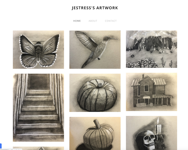
Jestress's Artwork
This is my Weebly site/blog. Weebly is a flexible and easy content management system to use!
The theme of this blog/site is my own artwork. I took a series of art courses last year, focusing on charcoal and colored pencils, and I just wanted a place to show off my drawings. I will probably add more to the collection later.
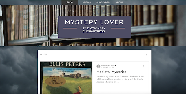
Mystery Lover Blog
This is my Wix site/blog. I don't update it very often, but I heard that Wix sites and blogs are easy to make and maintain, and this is true! Wix is probably the easiest content management system that I've used so far!
The theme of this blog/site is mystery books, but adult books, not children's, like my main blog. I am a notorious book hoarder, and I have plenty of mystery stories, just not as much time to get through them as I'd like, which is why I don't update this site very often.
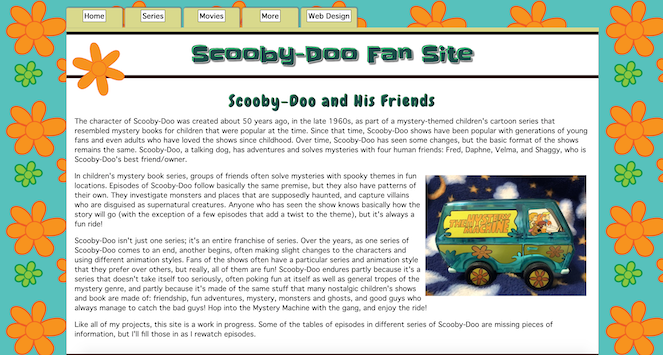
Scooby-Doo Fan Site
I chose Scooby-Doo as the theme for this site both because it's my favorite nostalgic children's cartoon and because it allowed me to experiment with sorting tables using JavaScript. One of the primary features of this site is the tables I've made of episodes in each series incarnation of Scooby-Doo, and most of these tables allow the user to sort them according to the type of ghost or monster that appears in the episode. When a user checks one or more of the checkboxes at the top of the table, only episodes with that type of ghost or monster will be displayed in the table below. A fun way to practice sorting!
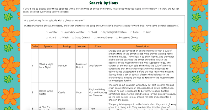
I also created a more decorative form of horizontal navigation than I've used in previous sites, designed to look like the tops of file folders. The file folder tabs move upward and change to a lighter color on hover. The logo has a different type of animation from the animated logo that I used on Free and Cheap Things To Do, although I have to admit that the constant rotation would probably be more of a distraction than an attraction on most sites. It was purely an experiment here. I also included sections of collapsible content on the page detailing the different series of Scooby-Doo. I used text shadows to create a mild 3D effect on the site title.
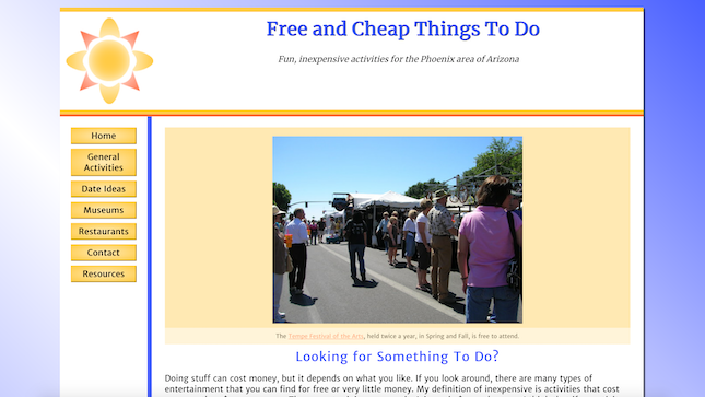
Free and Cheap Things To Do
I originally created this site as a final project for a web design class, choosing the theme because I had already planned to create a site about inexpensive entertainment ideas. This site is one of my favorites because I really like the layout I used and the way I designed the buttons to not only change color but move like real buttons being pushed. I have more information that I would like to use to expand the site, and I'm also considering moving it to a new home because the hosting service I used doesn't allow for the use of PHP, and part of my vision for expanding the project includes the use of PHP and MySQL for organizing form data, particularly the placeholder form on the contact page. At the moment, the contact form is just a placeholder that reprints data entered in the form beneath it. I have a new hosting service that I'm considering using, but I've decided to postpone the move because of the pandemic, which has negatively impacted some of my entertainment suggestions. Eventually, I'm sure conditions will improve further, and when things are more settled, I can move the site to new hosting and update it. The sun logo in the corner of the header is animated, and I created the logo myself.
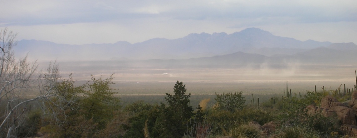
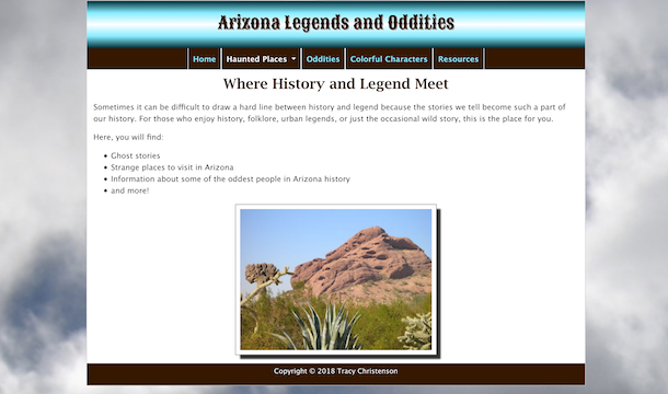
Arizona Legends and Oddities
This was the very first site I ever created using Dreamweaver. I coded all of my previous projects by hand using text editors. I created this project for a class, using pictures that I took myself from trips around Arizona. Even the cloud background of the site is mine. I chose the colors of the site to coordinate with the colors of the pictures, with blues and browns. These are colors that I'm accustomed to seeing in the countryside of Arizona, although parts of natural scenery are more of a reddish brown, depending on the area. I wanted the site's background colors to complement the colors in the photographs but not compete with them, so I didn't want to make the shades completely identical. I chose grayish clouds for the background of the site instead of whiter clouds on a sunny day because I thought the gray clouds set a more mysterious tone for the legends and ghost stories I have in some of the pages. I have in mind some additional material to add to this site. One of the features that I included that is not on my other sites is the addition of Google maps to point out the locations of interesting places in Arizona.
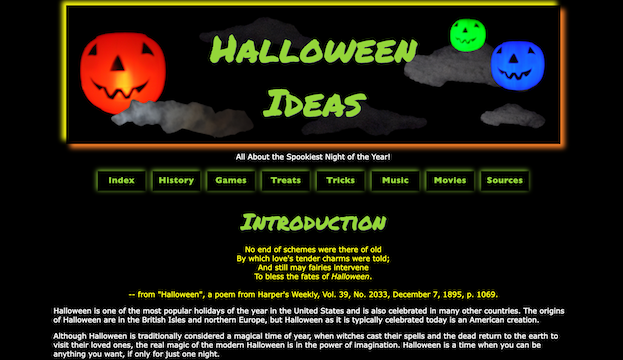
Halloween Ideas
Few web design students can resist the urge to make a website with an all-black background. It can be beautiful, seeing neon colors and bright white text glowing on a dark background. Plus, if you're reading at night, the black background feels less harsh on the eyes than a searing white background (a number of my fellow students complained about this when I was working on my degrees). In the beginning, I started writing this site to get all my black background urges out of the way so they wouldn't come out at a less convenient time. The Halloween theme seemed like a natural for the project, especially since I'd just bought a book about the history of Halloween.
Generally, I'm pleased with the colors I chose, although I do have a few changes in mind for this site. One thing that I'm most pleased about the color scheme is that I successfully avoided the urge to put red text on a black background, a typical rookie mistake for people who don't know anyone who is color blind. You can combine red and black in some ways with web design, but be careful, because one of the more common forms of color blindness is an inability to see the color red. The key in making text stand out on a screen is contrast between dark and light. Red appears "bright" to people with normal vision because it's a vivid color, not a light color, so there is actually less contrast between red and black than most people might think. To color blind people, all the vividness of red is gone, and red appears so dark and muted that it can be practically invisible on a black background. (There are different forms of color blindness, so individual results may vary. I use my father's form of color blindness as an example. As near as I can tell from his responses to color samples, red appears as something like a muted dark brown to him, and in some cases, is nearly identical to black.) So, although red and black can be used together in some ways, important text should never been written in red on a black background.
Later, I also used this site to practice some JavaScript concepts when I was first learning. Most of those parts of the site still remain, although I'm thinking of making some changes to those as well. I have some nice interactive forms on the site, and an API. One of the APIs I set up before no longer functions because the service was discontinued, and I had to remove it, but I’ve been considering replacing it with something else.
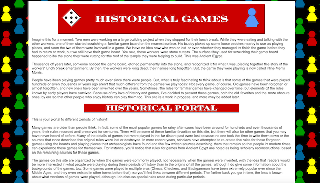
Historical Games
This is the first website that I made, an expansion on an old class project, coded by hand, that I still continue to improve and update. Part of the point of this site was to experiment with different types of graphics, which is why the different historical periods on the site have their own styles. I took all of the photographs on the site myself and created all of the backgrounds and other graphics, using GIMP. It’s kind of a sampler of what I can do with graphic design. I have plans to redo some of the graphics, particularly taking new photographs and replacing buttons and headers, and I also have more information to expand the content of the site, possibly adding a couple more sections. Even though I want most of the images to be ones I’ve made myself, as they all are now, I've been thinking that I might also look for some stock imagery to fill it out because there are some things I can’t photograph simply because I can’t get to the places that have them to get photographs.
One of the design challenges associated with this site was creating game boards which users could print from their home computers so they could actually play the games. So far, what I've done has worked well enough, based on feedback from site users. A site user even showed me how he transferred one of my board designs onto wood (with my permission) to create a wooden playing board. However, I would like to further refine the designs of some of the boards.
I’ve also been using this site to learn more about SEO, and I’ve had some suggestions from Google Search Console for improvement. I'm working on improvements for the site, although the content has already gotten some attention and compliments from some very interesting people. I’ve actually been contacted by a couple of museums with questions about old games and someone from the University of Jordan who wanted to swap source material.
Personal Blogs
I keep a couple of personal blogs, mostly about books that I've read, in order to keep my writing skills sharp and to try out different blogging/site creation platforms.
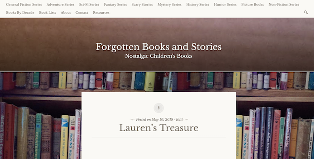
Jestress's Forgotten Books and Stories
Wordpress is one of the most popular content management systems, so I couldn't resist trying it myself. I made a free Wordpress.com blog and then changed it to a paid account to see what the extra features were like. In some ways, I admit that I was disappointed by the extra features. I did not try the highest level of paid account because this is a hobby blog, not a business blog. However, I'm a little disappointed at the interface. It's pretty user-friendly, but I think that Blogger offers more opportunities for theme customization for free than Wordpress.com does for a paid account and is still easier to use. However, Wordpress.com makes frequent adjustments to its format, and most of the changes I've seen in the last few years have been an improvement. I like how they corrected for some of the errors that I noticed when I first began to use it, such as the positioning errors with images. At first, I kept having to code the alignment of images myself by hand because, if I made the selection of alignment from what they offered, the images would end up outside of the containers for blog posts. This error no longer happens now that they've switched to their block format. The block format is definitely an improvement!
The theme of this blog/site is nostalgic children's books (no book on this site is newer than ten years old), but to make my site different from other book review blogs/sites, I decided to create a section called Books by Decade to both organize past posts and tie them to the events of the decades when they were first published. I've always loved history, so it wasn't difficult to list some of the major events of past decades, add some additional resource lists for each decade, and also try to put the lives of people born in each decade into perspective by discussing how old they would be at certain, major points in history. I wouldn't call this a scholarly historical analysis because this is still a hobby site and even the historical sections are peppered with my personal opinions. I have done scholarly writing before in college, but mainly, I was having fun with this. Since this site is mainly about my personal reviews, much of it is personal opinion. Another distinctive aspect of my blog/site is the Book Lists page, which has books and series grouped by theme, including book lists for children's movies that were based on books. Across the top of the page, the main navigation provides pages of series books in particular genres. As with my other projects, this blog/site is always a work in progress, so there are lists and sections waiting to be added.
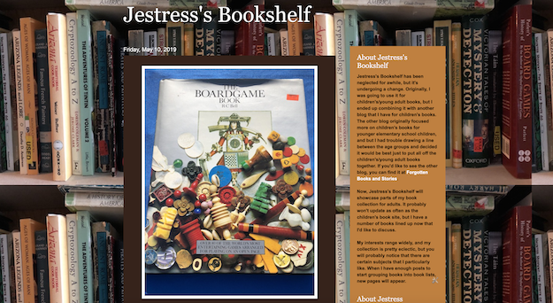
Jestress's Bookshelf
I decided to try Blogger so that I could compare it to my Wordpress.com site/blog. It was easy to get a Blogger blog because anyone who has a gmail account can have one for free. Between the two, Wordpress.com and Blogger, Blogger offers more options for customization with the free account. In order to change the CSS in Wordpress.com, you have to have a paid account, but Blogger allows CSS customization for free and is easy to use. However, I've been reading other criticism of Blogger since, which makes me wonder if I really want to do more with this blog or restart the blog elsewhere. I don't have much content posted right now, so that wouldn't be difficult, and I really only started this blog to study the way that Blogger functions in the first place. I think that the issue of content ownership might prove to be the deciding factor, but since I have so little content here right now, it's not an immediate issue, and before I rush to try something else, I have some other tinkering to do.
The theme of this blog/site is books, but adult books, not children's, like my other blog. I am a notorious book hoarder, and I have quite a lot of books on a variety of unusual topics. This blog is meant to showcase some of the more unusual parts of my collection.